
Many of us learned to type (or keyboard, as it’s often called these days) on a typewriter of some flavor. I’m old enough to have started typing on a manual, but quickly graduated to an electric. We learned more than just the layout of the QWERTY keyboard, the home row, and not looking at our hands. We learned typing conventions that were specific and unique to the machine we were using. While appropriate for typewriters, some of those conventions have become bad habits when using a word processor on a personal computer. With the advent of personal computers—and especially with the introduction of the Macintosh in 1984, which brought the graphical user interface (GUI) and WYSIWYG (what you see is what you get) to the “rest of us”—the machine for putting words on the page changed. But even today, more than 40 years later, those old typing conventions are still pervasive. People who have never used a typewriter are using them. I know from personal experience that typewriter conventions were still being taught in high school business typing classes, using Windows PCs and Microsoft Word, as recently as the 2000s (I did some substitute teaching during that time).
In 2018 I posted to this blog about a simple style guide that came to my awareness early in my graphic design career. The book is titled The Mac is Not a typewriter, Second Edition by Robin Williams. She also published a companion version titled The PC is Not a typewriter. In this post I’d like to dive a little deeper into the second most important tip in the book, use only one space between sentences.
Even all these years later when computers and word processing apps are ubiquitous, I still receive text for design projects where the author (or person who types the content) puts two spaces after end-of-sentence punctuation. For those of us who learned to type on a typewriter, that is appropriate when using a typewriter. But computers are not typewriters. It’s easy for me to search for the double spaces and replace with a single space as part of the design process for publishing the work. But all of us can benefit by learning to break that double-spacing habit to create more professional-looking content.
Here’s why. Typewriters, for the most part, do not give you a choice of typefaces. Originally, there was only one typeface. Later on, electric typewriters provided a way of using different typefaces, but only one at a time (e.g. the ball on the IBM Selectric). Either way, all the characters on a typewriter are monospaced, which means every letter, number, and punctuation mark takes up the same amount of space. For example, the letter i takes up as much space as the letter m even though it is obviously a skinnier letter form. Since all the characters are monospaced, a double-space after punctuation was needed to give the reader’s eye a visual clue to detect the break at the end of each sentence.
Most of the typefaces (fonts) you use on a computer (Mac or PC doesn’t matter) are proportional. Each character takes up a proportional amount of space based on how skinny or wide that character happens to be. The letter i only takes up about a fifth of the amount of space as the letter m. The space character (yes, on a computer the spacebar inserts a character—it’s invisible) is also proportional, so only one is needed at the end of a sentence. Take a look at these examples:

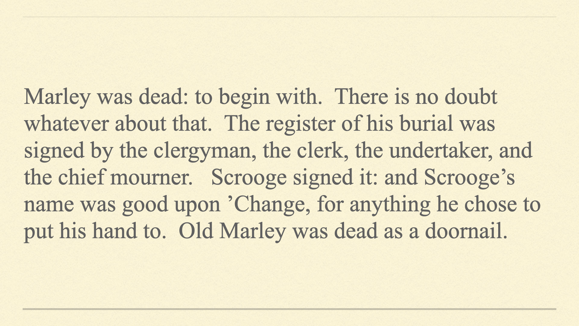
See how the letters line up in columns, one under the other? That’s because each character takes up the same amount of space. This is why it’s desirable to use two spaces to separate sentences.

Notice how nicely this paragraph is spaced? This is what we are used to seeing for professionally typeset work. Each character only takes up a proportional amount of space based on that character’s form. Only a single space is necessary between sentences.
The one-space rule applies to any punctuation you use in your writing—colons, semi-colons, quotation marks, exclamation marks, question marks, etc. It’s a tough habit to break, but well worth the effort. Your text will look much better if you do. Take a look at the example paragraph using proportionally spaced text and two spaces after punctuation:
See the big gaps after each sentence? You will never read professionally set text that looks like this.
There are, of course, exceptions. If you are working for someone who insists on double-spaces or you’re going to school and your instructor wants you to use two spaces at the end of sentences, it’s probably not worth arguing about.
Certain niches like screenwriting may require you to use monospaced fonts on your computer, which would neccessitate double-spacing after punctuation. Maybe your publisher insistst on manuscripts being submitted set in Courier* even if you are using Microsoft Word. In those cases, do what is asked. If you’re not publishing it or it’s your email or personal correspondence, double-space or not—whatever is comfortable for you.
However, when using a computer with proportional fonts, all your writing—even your emails and other personal correspondence—will appear more professional by kicking the double-space habit.
P.S. You may be wondering what the first most important tip is in Ms. Williams’ book. “There are no little things.” As is often stated, the details matter. Steve Jobs put it this way, “When you make something with care, even though you don’t know who the people using it will be, they will sense it. Care is a way to express our love for the species.”
*Courier is a common monospaced font on both Macs and Windows PCs.


Leave a reply to gluckmac Cancel reply